 NobleNox Designs
Restaurant in Albania · Client work
Brio
The problem
The restaurant needed a brand that would be recognised instantly on the street, on social, and in a competitive local market. Existing visuals were not memorable enough to own attention.
My approach
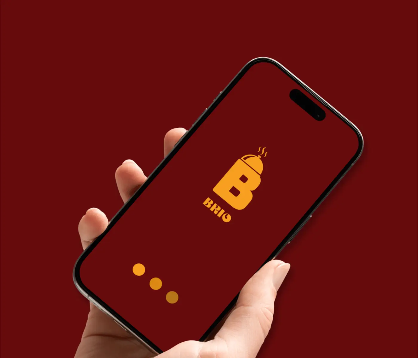
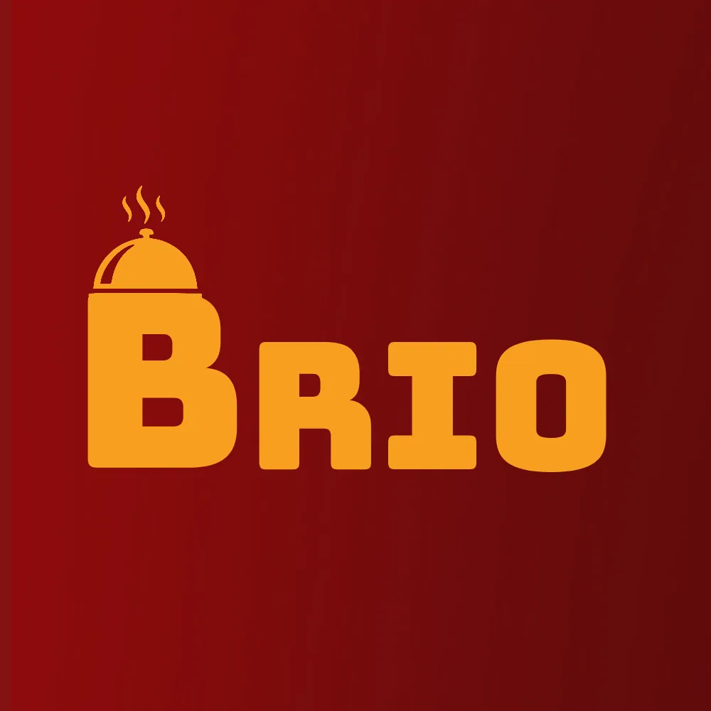
I researched colours that imprint quickly and carry psychological weight. Every element had to be noticeable, stand out, and still feel premium. A deep red became the primary signal. The Bungee typeface was chosen for its bold, slightly playful structure that felt food-related without becoming cartoonish.
The result
Brio is a thriving restaurant. It no longer struggles for recognition. The brand stands out and, in many cases, outshines its competitors.
Deliverables
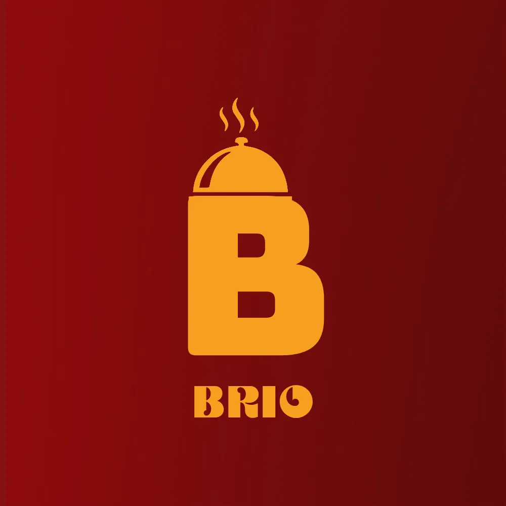
- Logo
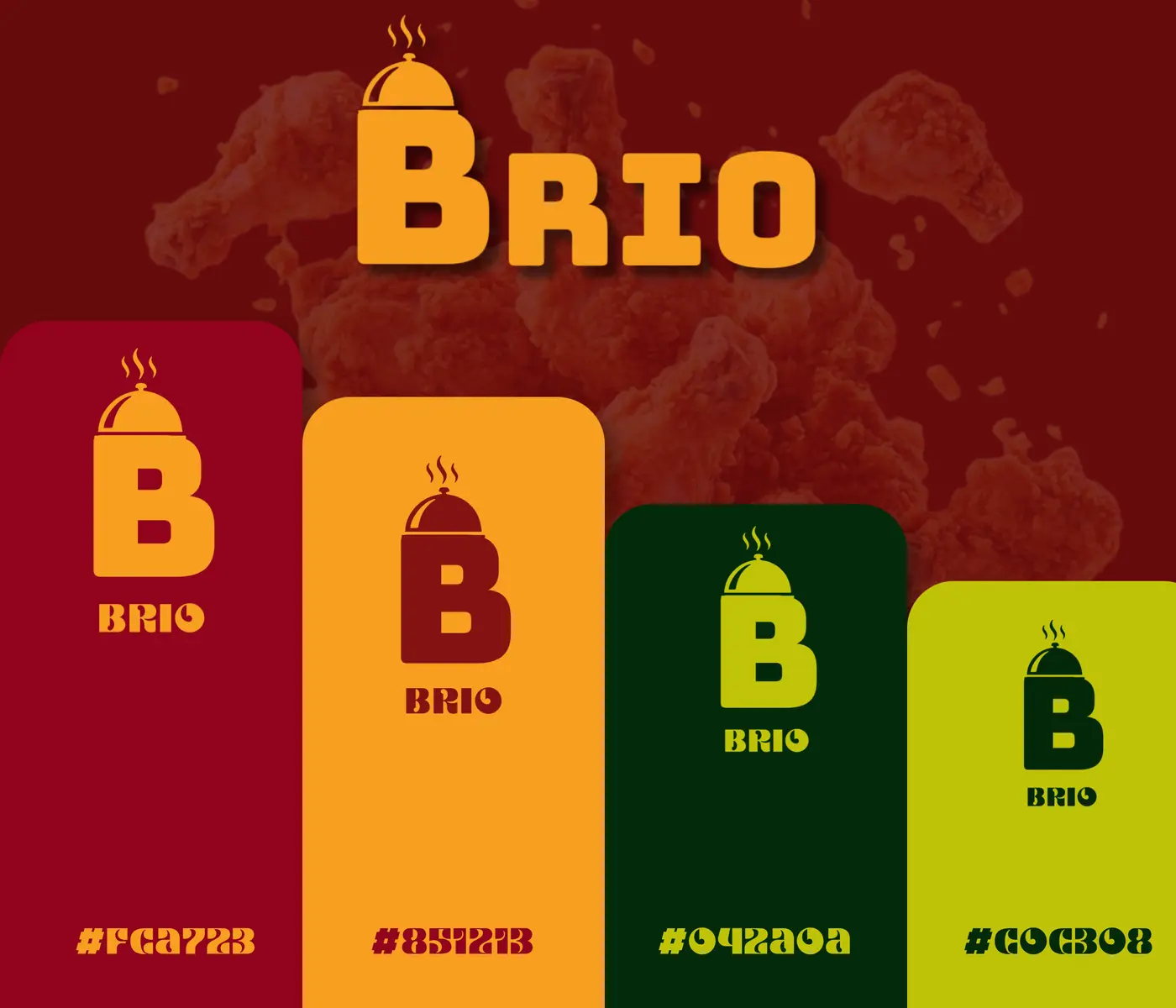
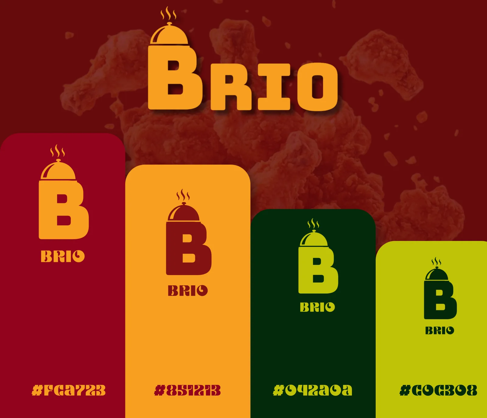
- Colour palette
- Typography
- Guidelines
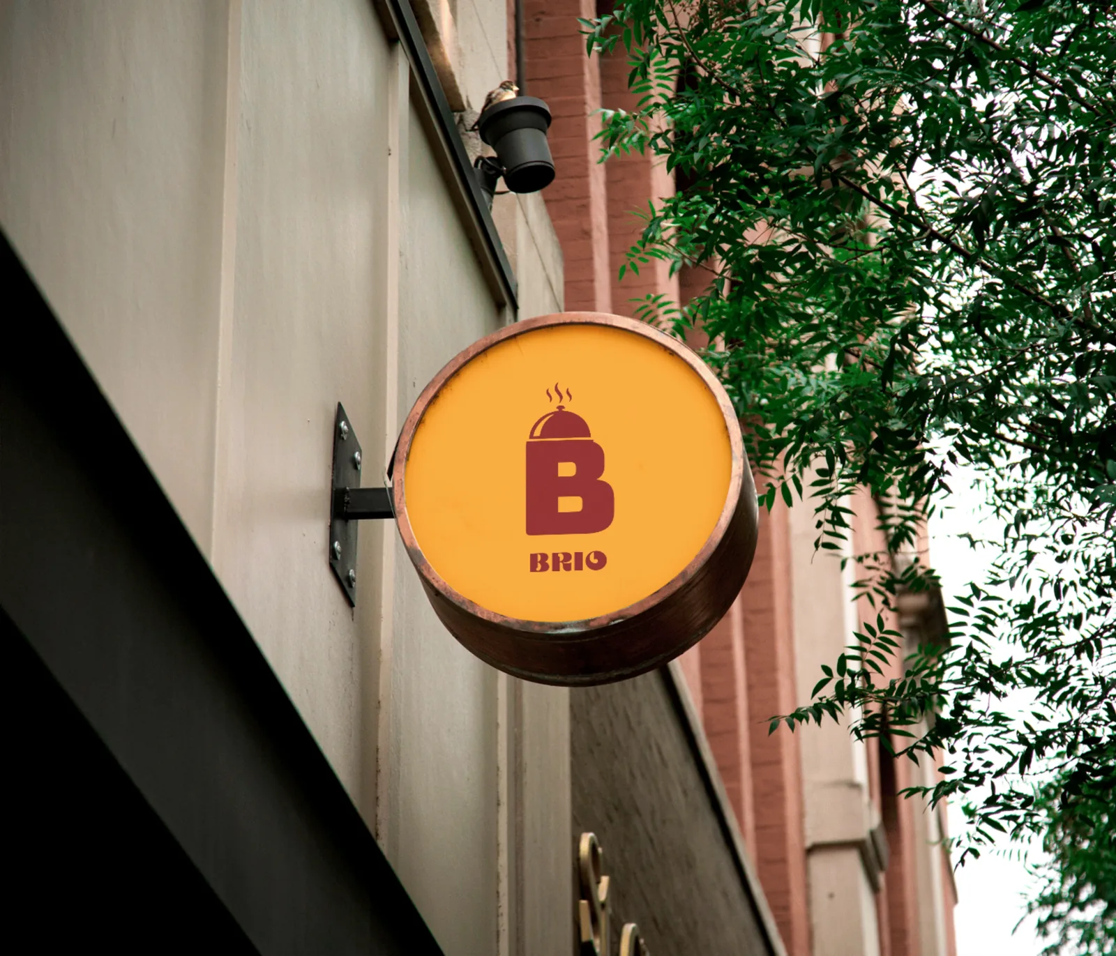
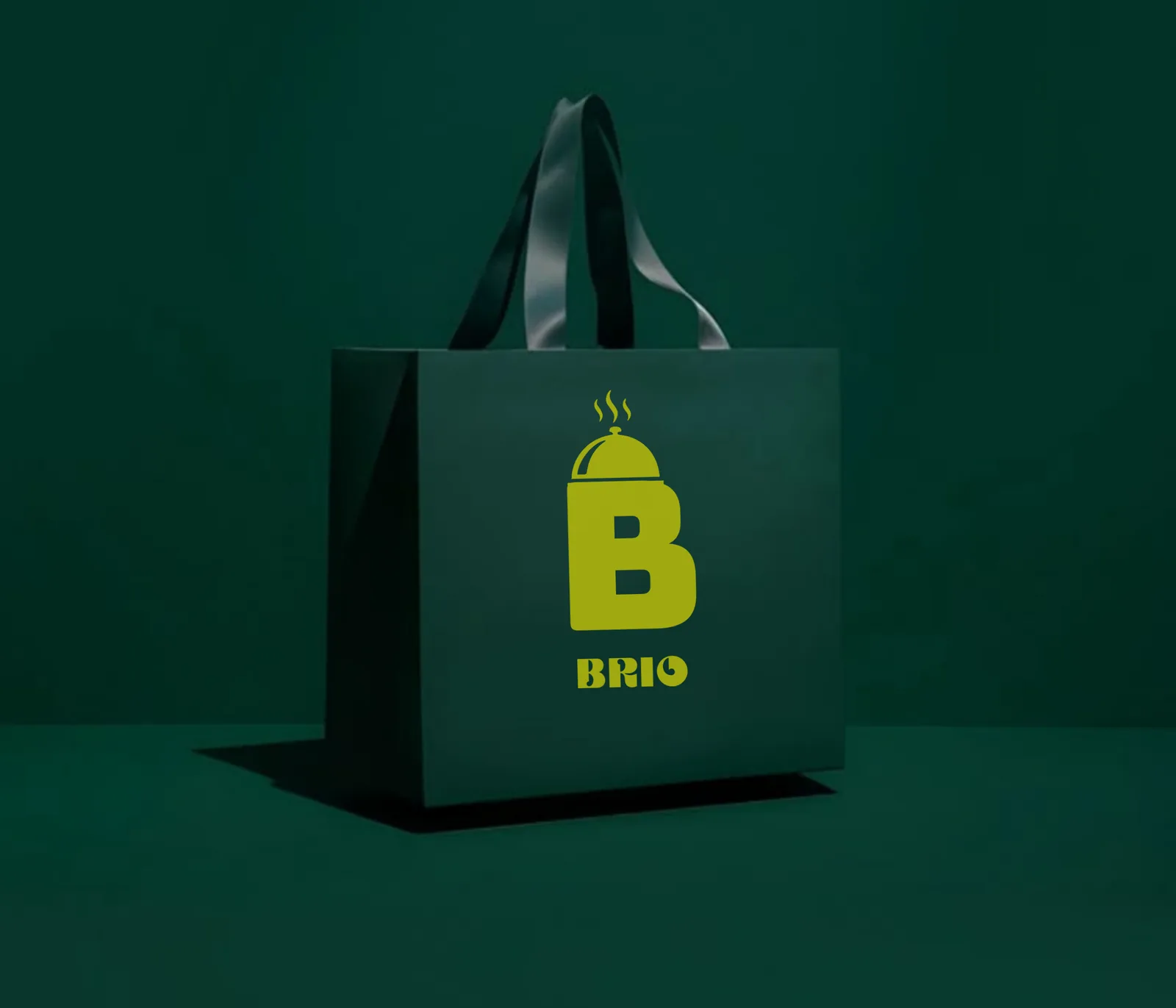
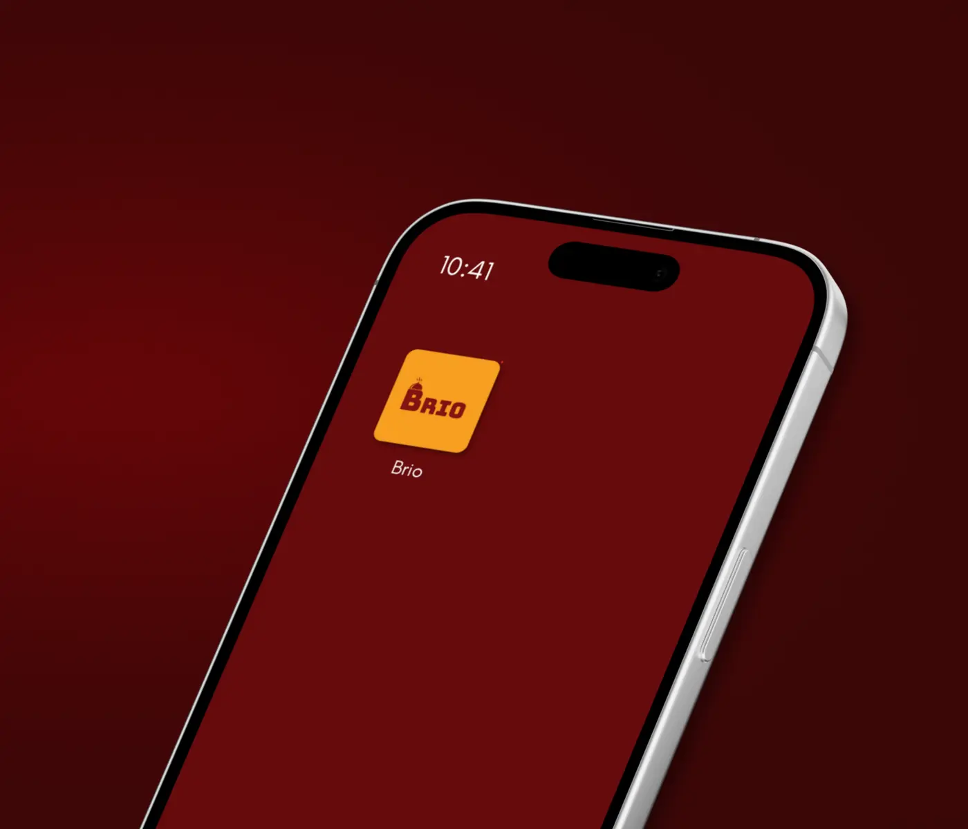
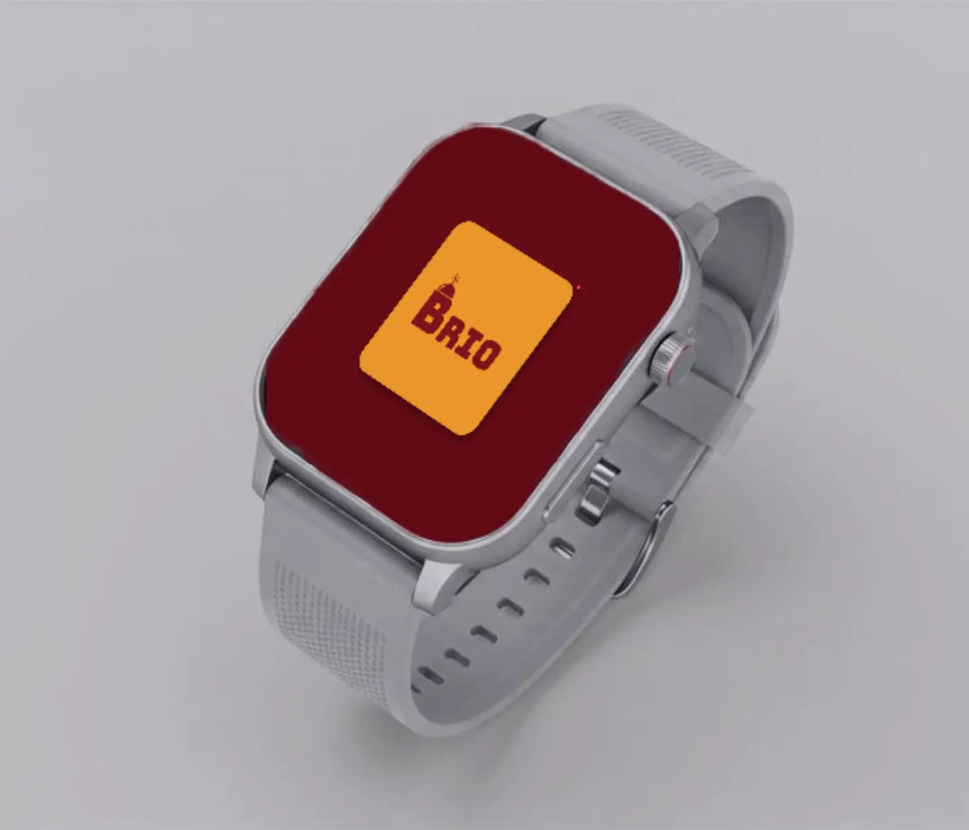
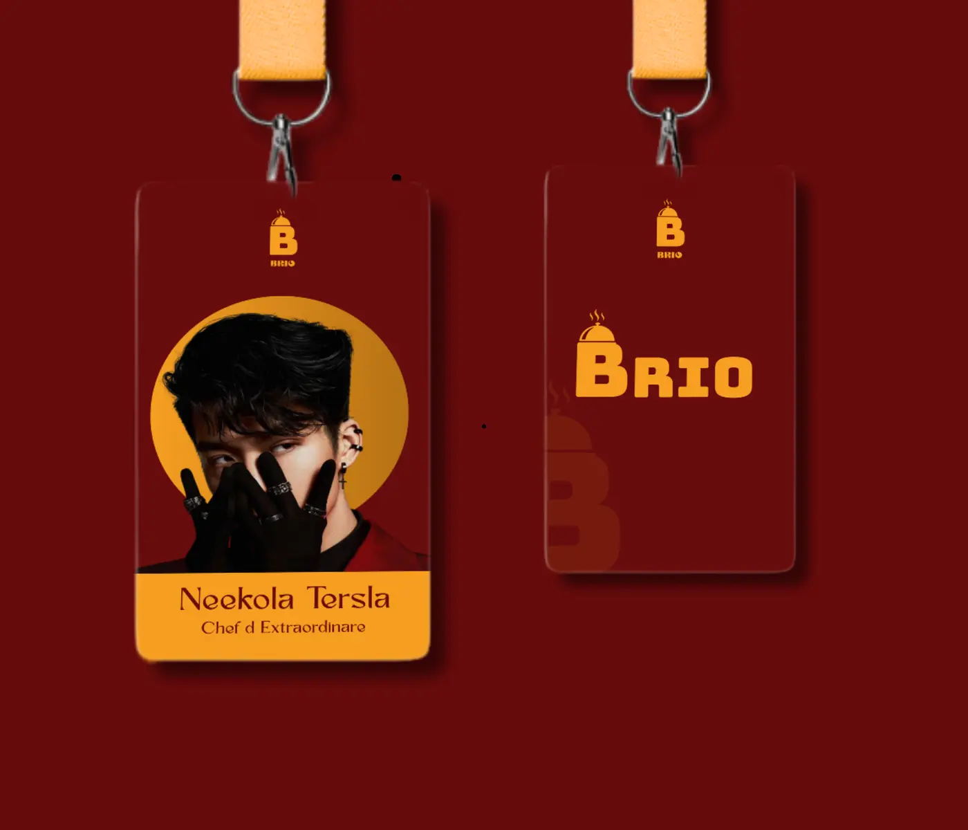
- Mockups
- Social templates
Typeface: Bungee
Colours
#91031D
#F79F21
#042A0A
#C0C308